
Used when only one value is applicable in a yes/no situation, and the yes/no statement is not contrived or obscure.
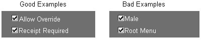
Examples of good uses of check boxes include Allow Override and Receipt Required, where the yes/no response is clear.
For example, the use of a check box with the label Male is contrived to represent the Male/Female choice as a question with a yes/no response, so this is an inappropriate use of a check box (it should be an option group). A second example, with the check box labeled Root Menu, demonstrates inappropriate usage of a check box because the opposite of Root Menu is not obvious.
In each of these bad examples, an option group or poplist item would present a more intuitive set of choices to the user.
A check box item is mandatory, and must always have a value (including a default value). (OMS-74035)
In a Find window, an attribute normally modeled with a check box is modeled with a poplist. The list must include values for the checked and unchecked states and should not be required so that a null entry appears as well. (OMS-74036)
[Translation] The recommended minimum width of a check box is 0.2," which displays just the check box with no label. In a single-row display, the minimum width is the larger of 1.3" or 30% wider than the label, to allow for translation. Always allow as much space as possible for expansion. (OMS-74037)
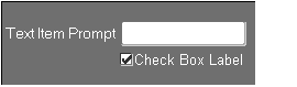
The check box itself is normally positioned as a text item would be.
When the label of a check box is very long, the check box may be positioned starting at the left end of the prompt of the field above.
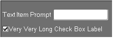
In the above example, the check box and prompt are aligned along their left sides. This alignment may of course not hold after translation to other languages.
Check boxes in multi-record blocks are 0.2" wide. (OMS-74038)
For a single-row check box, the Label must be used. For a multi-row check box, the Prompt must be used.
In certain cases, the user has a choice of options to choose from and may select more than one, but must select one at a minimum. If only two check boxes are available and the user deselects the only selected item, the other item should be selected automatically. A confirmation point may also be used later in the form to ensure that at least one item is selected. (OMS-74238)
For information on implementing check boxes, see the Oracle Applications Developer's Guide.
Coordination check boxes are used to control master-detail relations between blocks. See Master-Detail Characteristics